Skip to project
pedromartins.tech
Live
Web / Fan Project2026

ZombiesWeb

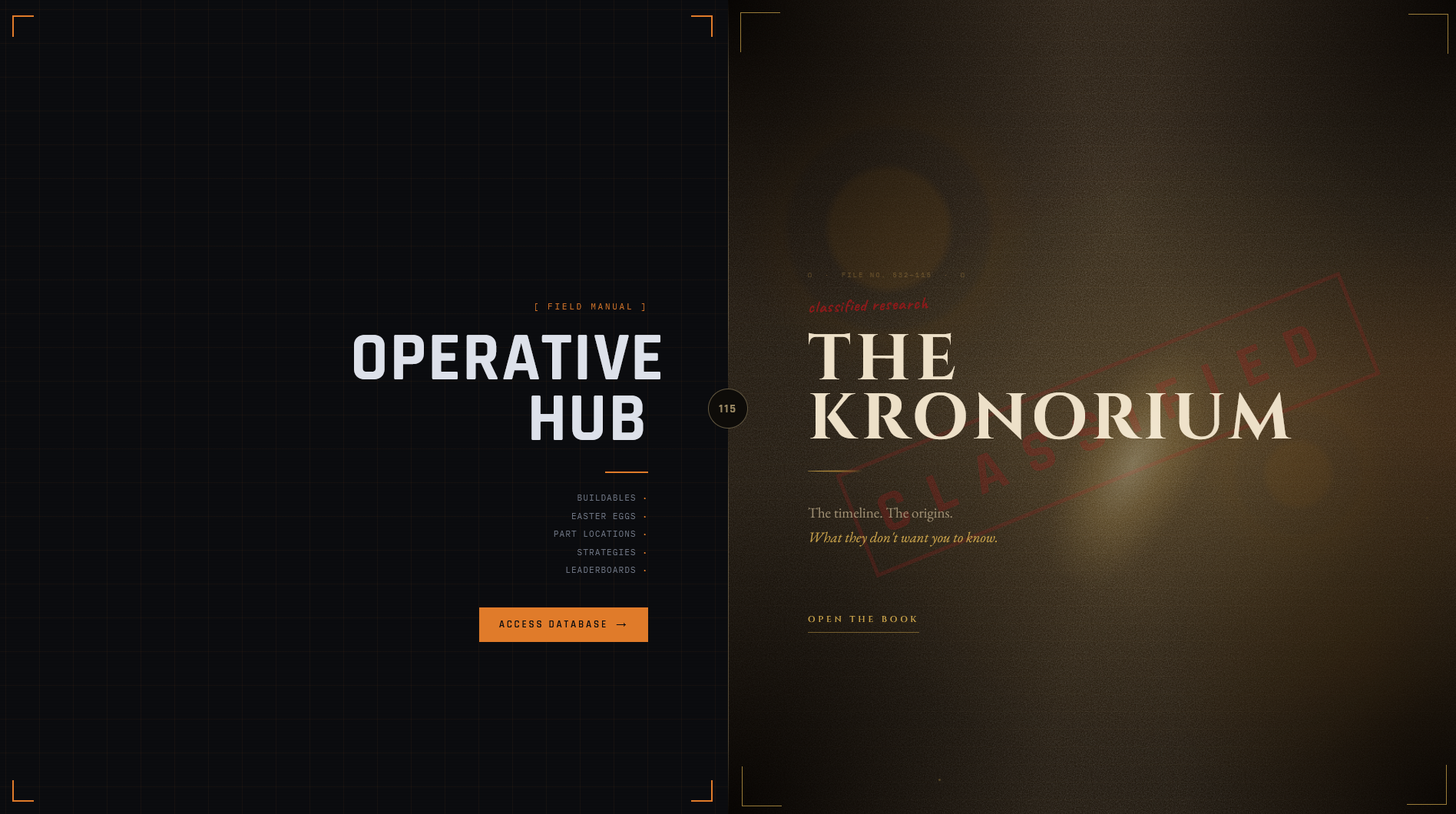
Designed ZombiesWeb as two purpose-built products within one project: an exploratory lore system for time-rich sessions and a rapid field manual for players already mid-round.

Role
Product designer and frontend architect
Environment
Dual-mode static-first web product
Ownership
Product strategy · Information architecture · Astro build · React islands · Timeline interaction · Field manuals · Performance
Open live project
ZombiesWeb project visual
kronorium-index5 system boundaries
Player
Astro Pages
Kronorium Island
Field Manuals
2products inside one connected project
ExploreKronorium interaction modeBetween sessions or on a larger screen
RetrieveField Manual interaction modeDuring a live round on phone or second monitor
Staticdefault delivery outside interactive islands
01 / Interactive system

Move through the system layer by layer

kronorium-indexDual-mode static-first web product · Read-only
Live
Interactive product miniature

One project. Two products. Different moments.

The audience overlaps; the job, attention, and device context do not. The interface changes because the moment changes-not for visual novelty.

Ω / Aether timeline

Trace a story, not a list

Drag left or right to explore
01 / 05
June 4th, 1918 · Excavation Site 64, France

Origins

The Primis story begins inside a timeline already shaped by cycles, fractures, and intervention.

Open the full Kronorium
READ-ONLYDual-mode static-first web producttool: experienceselection: fan

Player selected.

02 / Context

The problem behind the system

ZombiesWeb serves an overlapping audience in two incompatible moments. A lore fan between sessions wants to wander, compare eras, follow branches, and tolerate complexity. The same person during round 18 wants one shield location immediately and cannot afford to explore.

Treating both moments as one conventional website would make the Kronorium too shallow and the Field Manual too slow. ZombiesWeb is therefore structured as two complementary sites within one project, sharing a universe and routes while using different information density, navigation, typography, interaction, and technical delivery.

The visual split is functional rather than cosmetic: the Kronorium behaves like an archival knowledge graph; the Field Manual behaves like operational documentation under time pressure.

Read the full project overview

ZombiesWeb is deliberately built as two products within one project for an audience whose needs change with the moment. Between sessions, a lore fan wants to explore the universe, compare eras, and understand how branches reconnect. During a live round, often on a phone or second monitor, the same person wants one location or setup answer immediately. The interfaces diverge because the jobs diverge - not simply to create visual variety.

THE KRONORIUM - The exploratory side is a pan, drag, filter, and zoom knowledge graph built with React Flow. A full-canvas spatial interface, archival typography, gold story nodes, fractures, branch reasons, minimap navigation, and progressive lore detail encourage visitors to wander and build a mental model of the timeline. This route accepts greater density and selective React hydration because interaction is the product.

FIELD MANUALS - The mid-round side reverses those decisions. Static Astro routes, direct URLs, strong section anchors, compact industrial typography, orange wayfinding, and image-first location cards minimize time away from play. Easter egg steps, buildable parts, routes, and key locations are deliberately linear and scannable. No graph navigation is required to retrieve one answer.

SHARED PROJECT, DIFFERENT DELIVERY - Both products draw from the same content universe, but Astro's static-first architecture lets each route pay only for the interaction it needs. Field Manuals arrive as useful HTML with little or no hydration; the Kronorium hydrates its graph because spatial exploration genuinely earns the JavaScript cost.
03 / Decisions

The trade-offs that shaped the build

Decision

Structure one project as two products

Let the user's moment, not visual consistency, choose the interface.

Reason
The audience overlaps, but available attention, device posture, and desired outcome change completely between lore exploration and live play.
Trade-off
The two design systems need to feel connected without making either product compromise its purpose.
Revisit when
When research shows users regularly need a third mode or cannot identify which side fits their task.
Decision

Make the Kronorium spatial and editorial

Use a full-canvas graph, pan and zoom, branching paths, archival gold, and progressive detail.

Reason
Its job is sensemaking: visitors need to see relationships and are willing to spend time exploring them.
Trade-off
The flagship route carries more JavaScript, more density, and works best with space.
Revisit when
As the graph grows or mobile exploration becomes a stronger requirement.
Decision

Make Field Manuals linear and operational

Use static routes, strong anchors, compact headings, orange wayfinding, and image-first location cards.

Reason
Its job is retrieval: a player should reach one actionable answer with minimal reading and no canvas interaction.
Trade-off
The format deliberately sacrifices narrative immersion and cross-story context.
Revisit when
As new guide types reveal different mid-round lookup patterns.
04 / Evidence

Proof, source, and inspectable outcomes

05 / Implementation

How the decisions appear in the build

astro.config.ts
01// Static-first + a locked-down CSP. React hydrates only on interactive islands.02export default defineConfig({03  output: "static",04  integrations: [react(), tailwind()],05  vite: {06    plugins: [{07      name: "security-headers",08      configureServer(server) {09        server.middlewares.use((_req, res, next) => {10          res.setHeader(11            "Content-Security-Policy",12            "default-src 'self'; img-src 'self' data:; script-src 'self'; " +13            "frame-ancestors 'none'; base-uri 'self'",14          );15          res.setHeader("X-Frame-Options", "DENY");16          res.setHeader("Referrer-Policy", "no-referrer");17          next();18        });19      },20    }],21  },22});
Representative / sanitized excerpt

Static-first output with a locked-down CSP - React hydrates only where it must.

AstroReactTypeScriptReact FlowTailwind CSS v4GSAP
06 / Operations

The unhappy path is part of the design

01

What if a mid-round answer takes too long to find?

The guide has failed its primary job even when every fact is correct.

Signal
Long scans, repeated backtracking, or players returning to search.
Response
Shorten the path, strengthen anchors, and put location imagery beside the instruction it proves.
02

What if the Kronorium graph grows?

Node and edge density increases visual and runtime pressure.

Signal
Longer interaction startup and crowded navigation.
Response
Partition story eras, lazy-load detail, and preserve filters, minimap navigation, and direct guide routes.
07 / Security

Threats, controls, and what remains

No control is presented as total risk elimination.

Performance

Interactive graph slows every page

Control
Static-first delivery with selective island hydration
Residual risk
The Kronorium itself remains a heavier route.
Web security

Fan content expands script or framing risk

Control
Restrictive CSP and frame protections in the deployment design
Residual risk
Third-party media and future integrations need review.
Product fit

One interface serves both moments poorly

Control
Separate exploratory and retrieval modes under one shared information architecture
Residual risk
Some visitors still need clear orientation when moving between them.
08 / Results

What the project demonstrates

One audience can move between discovery and utility without forcing either moment into a compromise interface

The Kronorium makes branching lore explorable through spatial interaction

Field Manuals remain fast, direct, and usable during active play

What worked
  • The two products feel connected while each remains optimized for a different job.
  • The architecture spends hydration only where exploration earns it.
Next iteration
  • Measure transitions between the two modes
  • More graph partitioning
  • Formal lookup-time testing on guide pages
Professional signal
  • Product strategy
  • Context-driven interaction design
  • Frontend architecture